Seeing Red, or Maybe Green? How Tailwind Helps Colourblind Designers
Published on
As someone with colourblindness, it’s always been a bit of a struggle to design things and know I’m using the right colours.
Colours are used to denote so many things beyond just making something look pretty. Green for success, red for failure, blue for information, yellow for a warning, and so on. If you can’t tell the difference between them, you’re at a disadvantage, so how does Tailwind help with this?
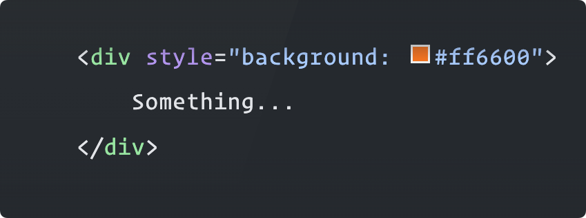
Traditional approaches to put colour into a design often result in us adding HEX codes like #FF6600, RGB codes like rgb(255, 102, 0), or some other variant that isn’t easily human readable to anyone except the few who can memorise them.
There are a handful of IDE extensions that make this easier though - for example Color Info for VSCode adds a colour preview next to any colour code you write, so you can visualise it side-by-side.
That’s pretty great if you can tell the difference between colours, but what if you can’t?
In the UK, about 8% of all men and 0.5% of all women have some form of colour blindness, so while it might not be the majority, it’s a huge chunk of the population that could be affected by this, not just a niche few.
You might reach for semantic names for CSS classes which can help with this as it abstracts that knowledge away - pretty much everyone knows that alert-success is green and alert-danger is red - so reading code like this helps a lot:
<div class="alert-success">
    Something happened.
</div>
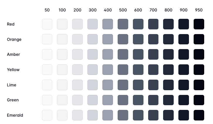
Tailwind does something a bit different though - by not applying or forcing semantic names, its colour palette instead provides human-readable names for colours, with a nice and predictable lightness scale. Instead of having to know if alert-danger is red, if I see a class of bg-red-500 I have even more confidence it’s a middle red, or bg-red-200 is a light red.
<button class="text-white bg-red-500 rounded hover:bg-red-400">
  Delete
</button>
This is a game-changer for me. I can now design things and dive into existing code with the confidence that I’m using the right colours, I can decipher context around code that doesn’t have semantic names, and I don’t have to look into using a third-party tool to help me understand what colour is being used.
This may seem like a small thing, but it’s an immensely empowering one. It’s a small step towards making the web more accessible for everyone, and I’m grateful for it.